
Do you know your mobile visitors?


It’s no big secret that responsive websites (that is, websites that “respond” to the screen size of the person viewing them and adapt, rearrange and resize accordingly) are Google’s best practise for mobile website solutions. That’s why we at Bluesky Interactive have been producing them for well over a year!
However, even a responsive website won’t do its job correctly if you haven’t actually thought about the needs of the person using the device.
We advocate actively considering mobile and tablet users alongside desktop right from the beginning of the website design process. Doing this will make you realise what content is irrelevant on the device, what content is being pushed too far down the screen, and will help you to come up with new arrangement or alternatives that offer a better user experience for your visitors.
Considering phones specifically, we think there are two key areas that are often overlooked with mobile visitors.
1. Consider screen sizes (and orientation)
Big screens are in – even the reluctant iPhone has increased its dimensions this time round, and the line between a phone and a tablet is getting increasingly blurry.
Phones aren’t quite as easy to fit in your pocket any more – and that means you need to think about how people will use them, and what way they hold them.
 Bigger screens, for instance, may need to be held with two hands to navigate the touchscreen easily – and this means that, because of the hand positions, content towards the bottom of the screen will be easier to reach, than that at the top.
To counter this, we’re currently looking into experimenting with menus that show towards the bottom of the page, instead of out of reach at the top.
On smaller screens, think about how much the content shrinks. Content can be shown smaller on a small screen, than on a big one to fit more in – but this can mean buttons are teeny and difficult to press with big chubby fingers on a little phone screen.
This is also part of Google’s user experience algorithm – there has to be enough space around buttons to make them easy to press.
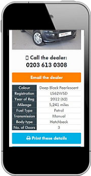
Why not look at the Alan Day VW website on your mobile for an example of clear, easy-to-click button usage?
2. Consider touchscreen gestures
Swiping, pinching and other touchscreen gestures are not actions you’d ever see with desktop-viewing mouse-wielders. This introduces a range of new considerations for your mobile visitors.
Can a customer zoom in on an image easily? Images that “zoom” by opening in pop ups aren’t mobile friendly, and visitors may also be expecting to pinch to see it closer up – and they expect the quality of the image to accommodate that action.
In the same vein, mobile visitors scroll using a finger on the screen. This gets awkward if you’re trying to scroll past a Google map as it results in you scrolling up the page rather than the page. You need to bear these types of touchscreen actions in mind to ensure you’d not actually be making your website increasingly difficult for mobile visitors to navigate.
For any more advice about making the most of responsive design for your website, visit Bluesky Interactive today or by calling 0845 415 4853.
